


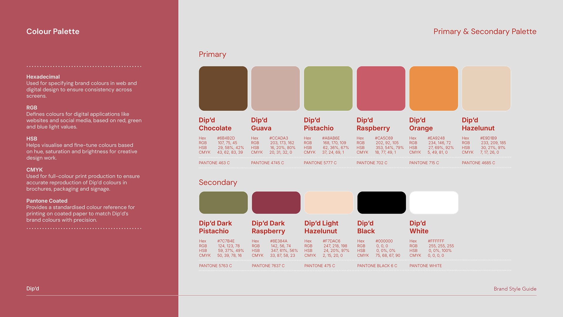
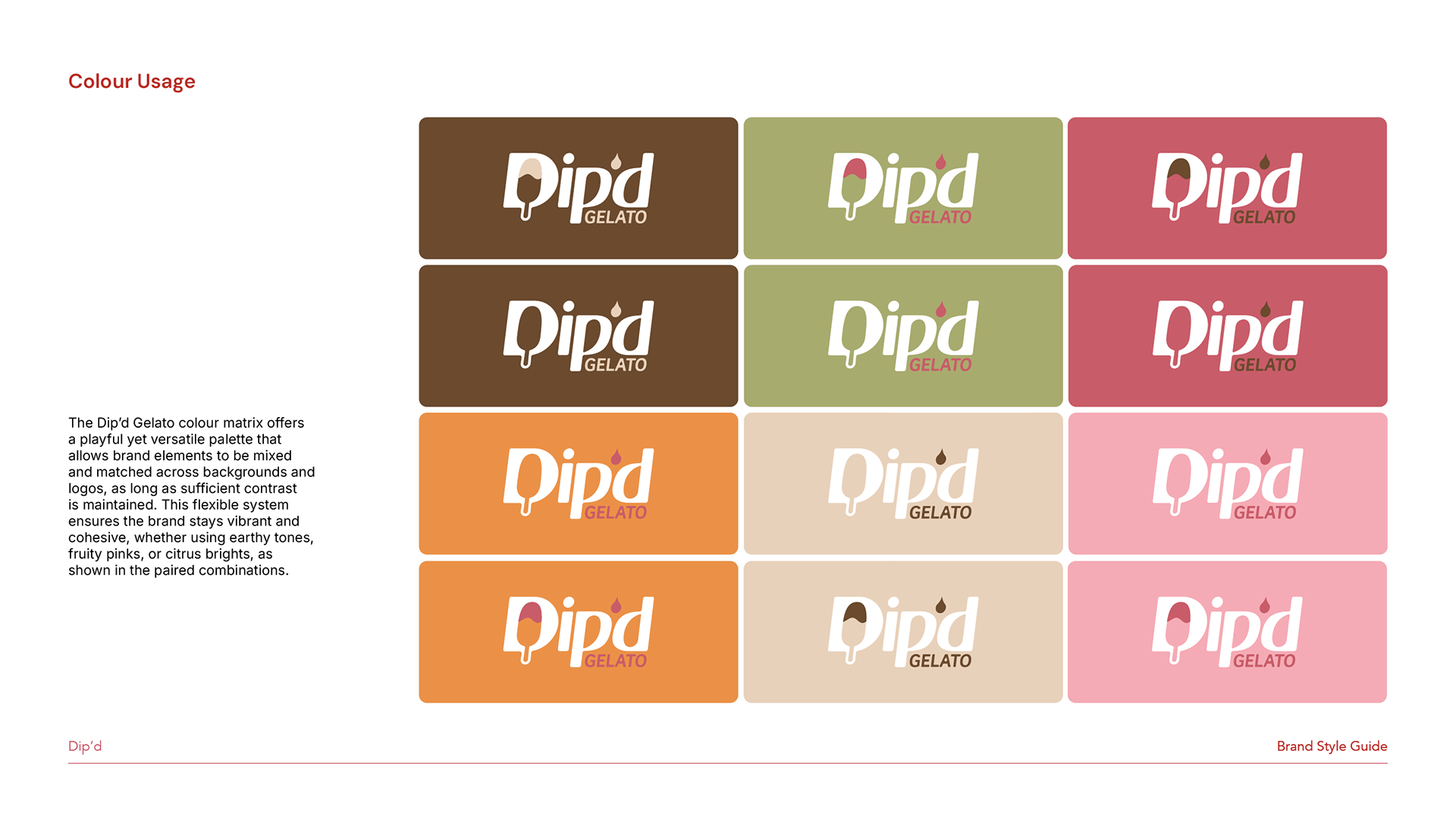


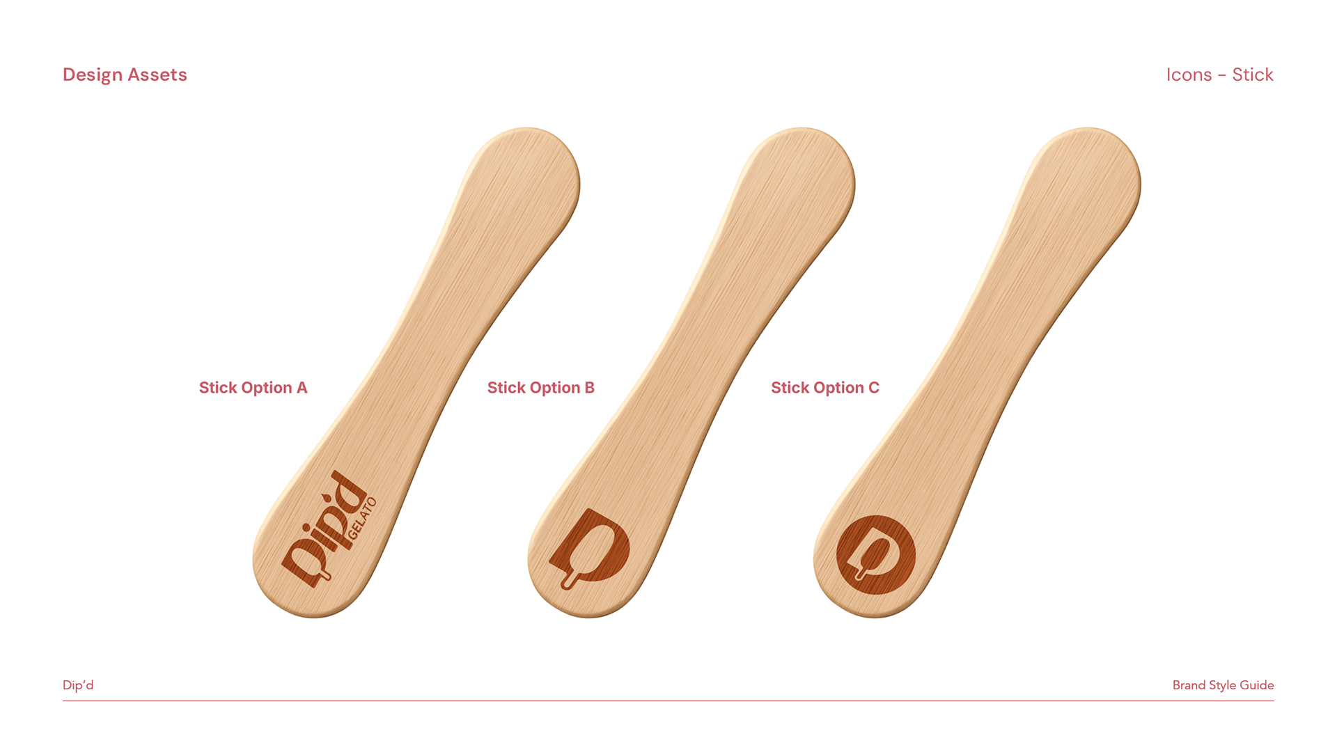
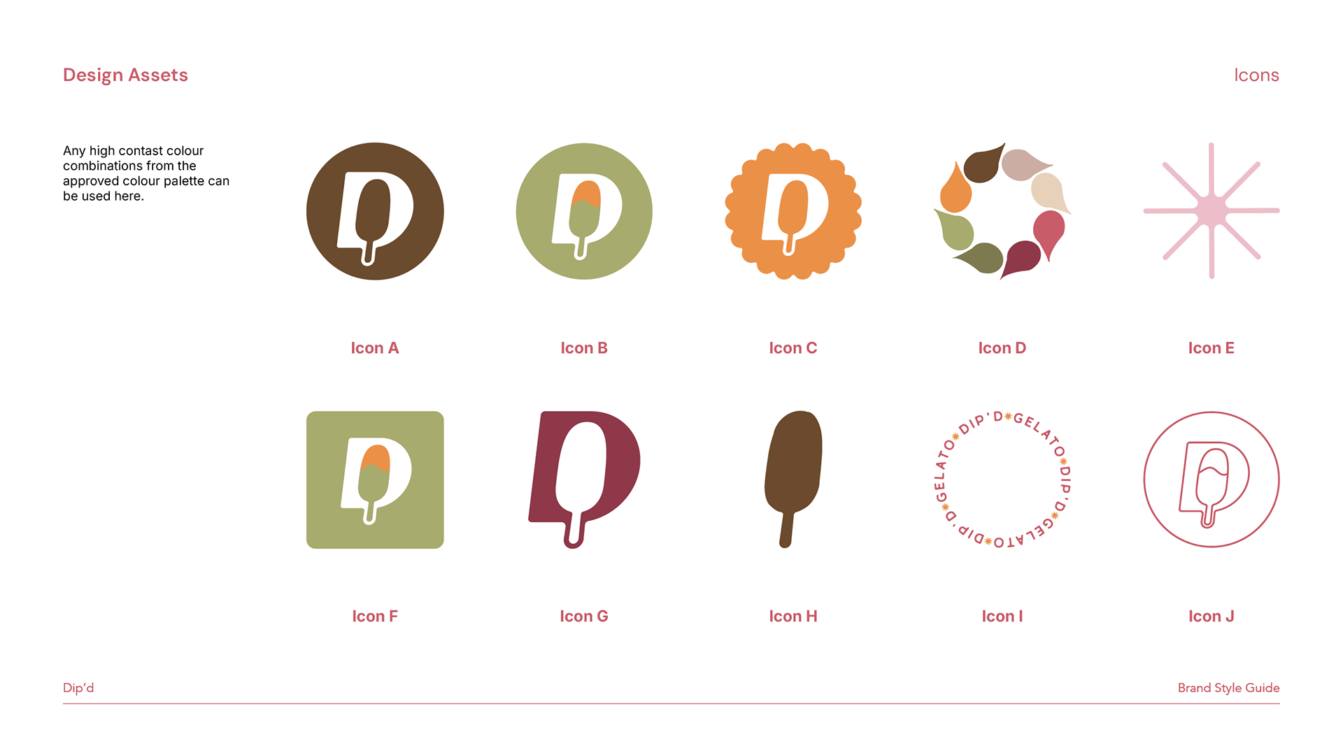
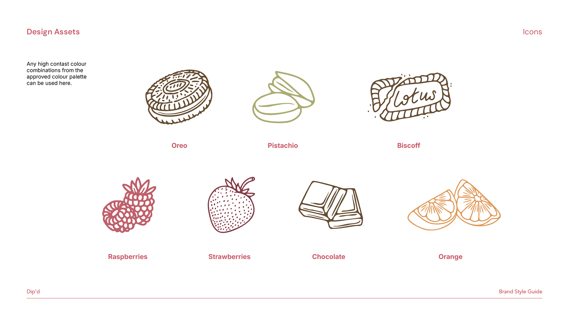
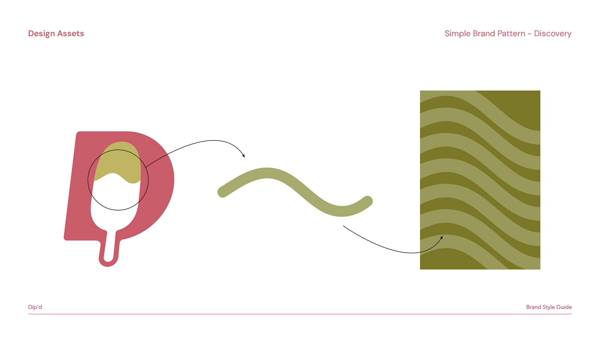
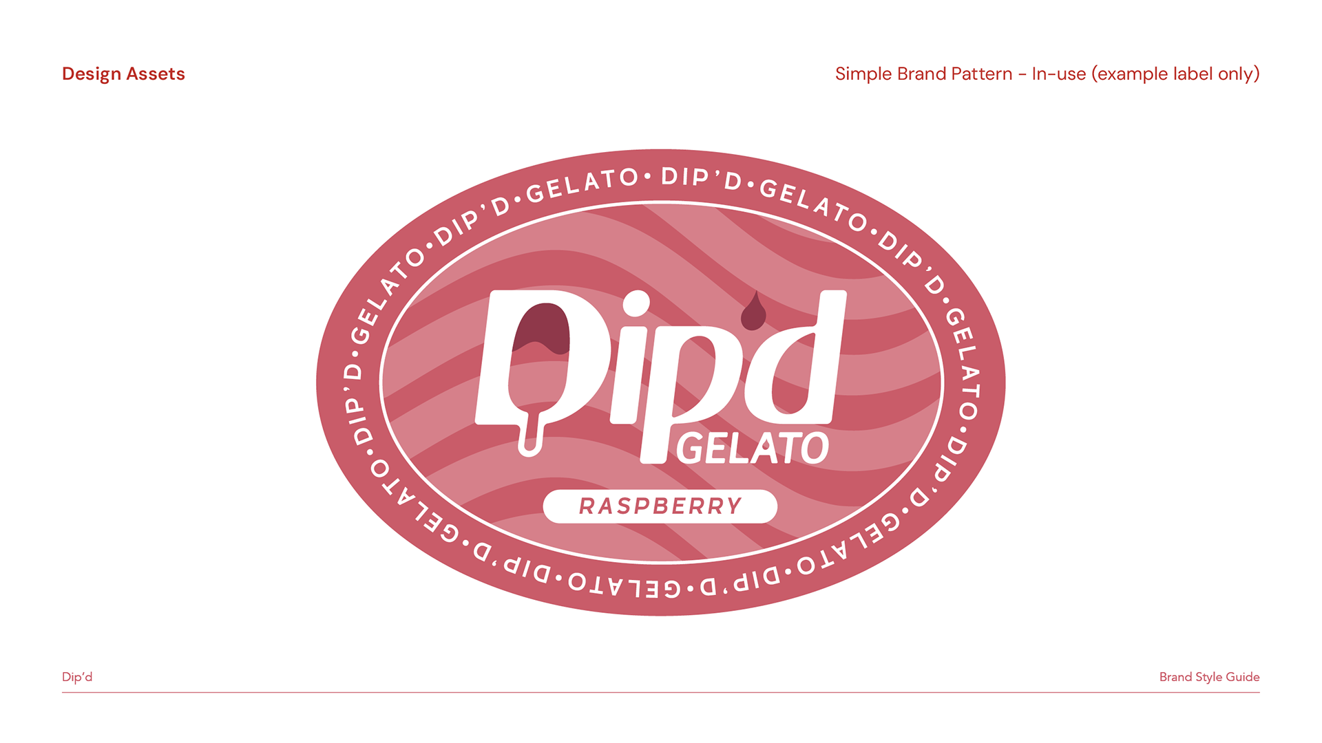
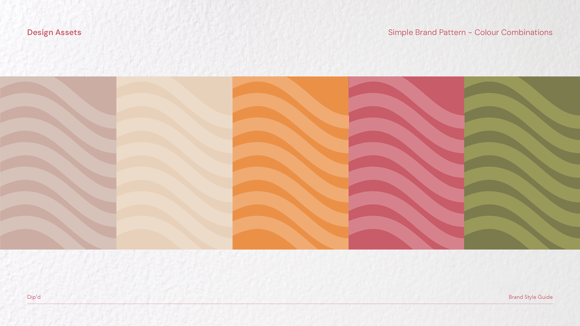
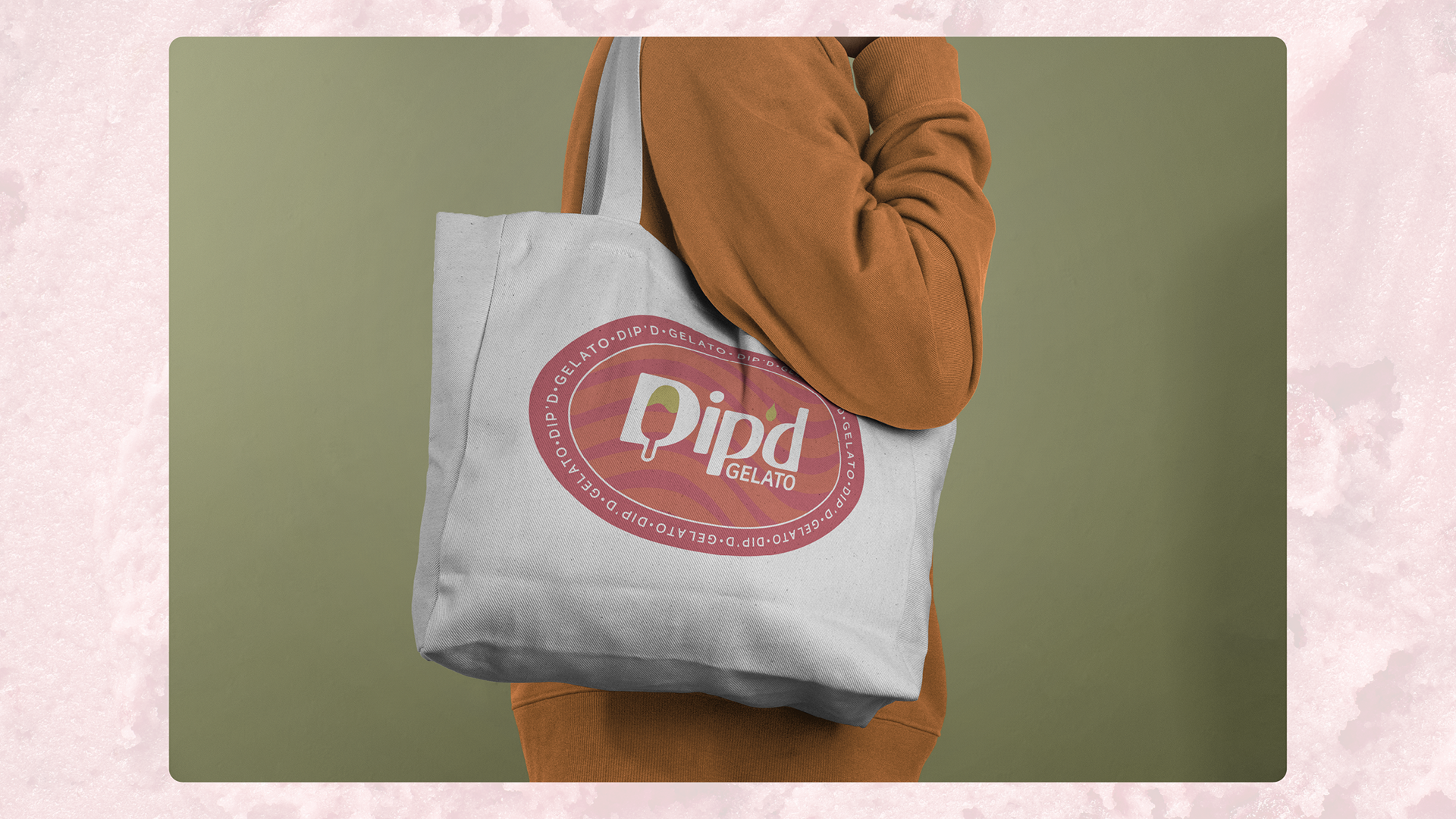
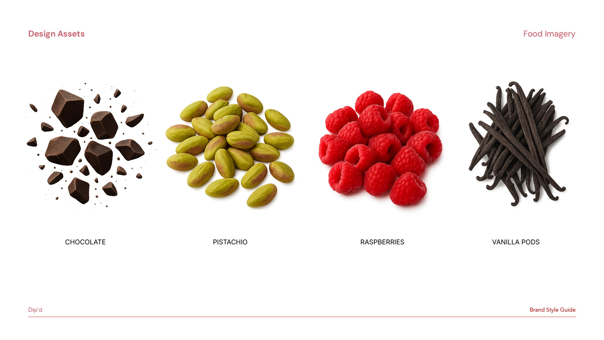
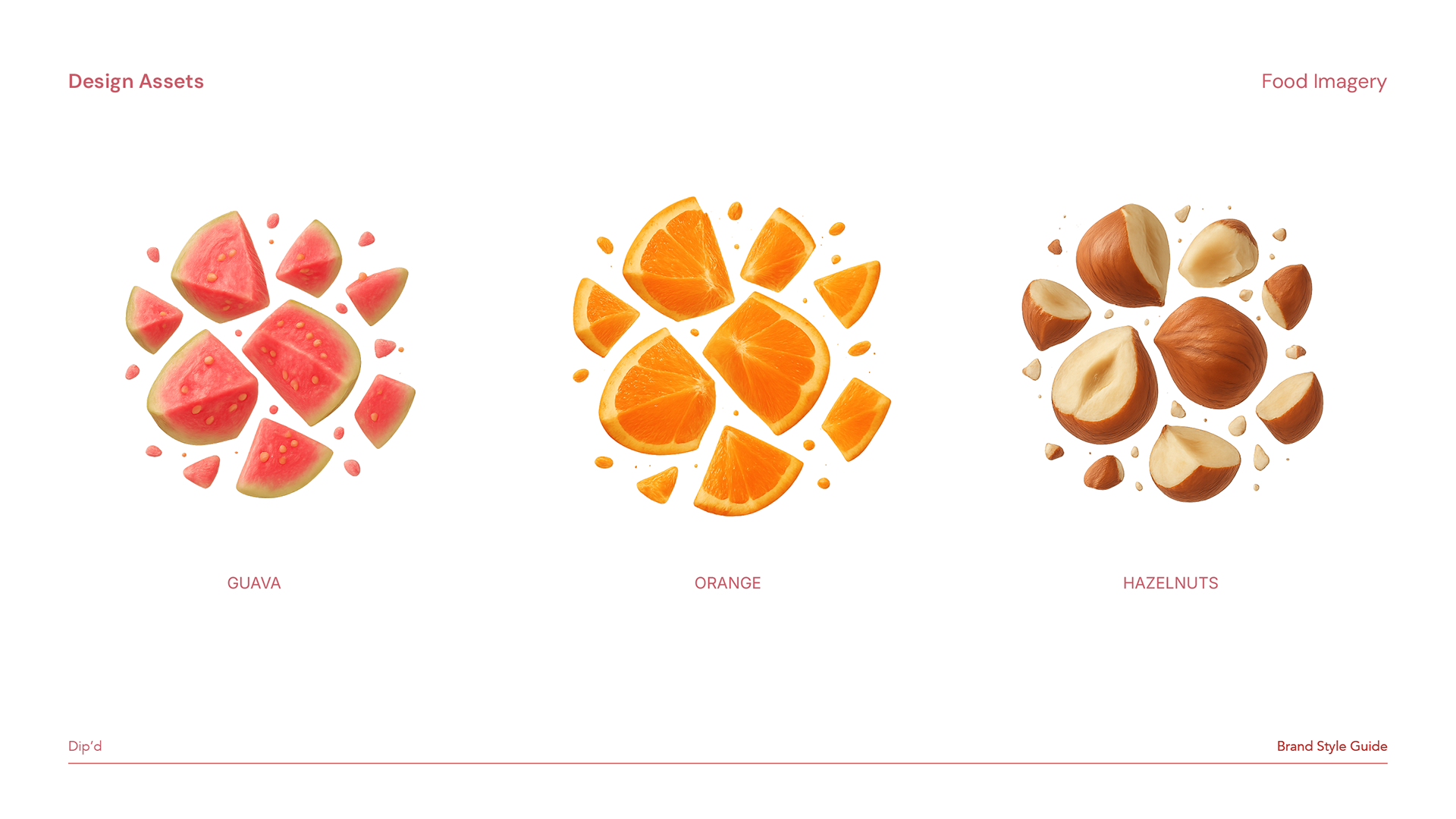

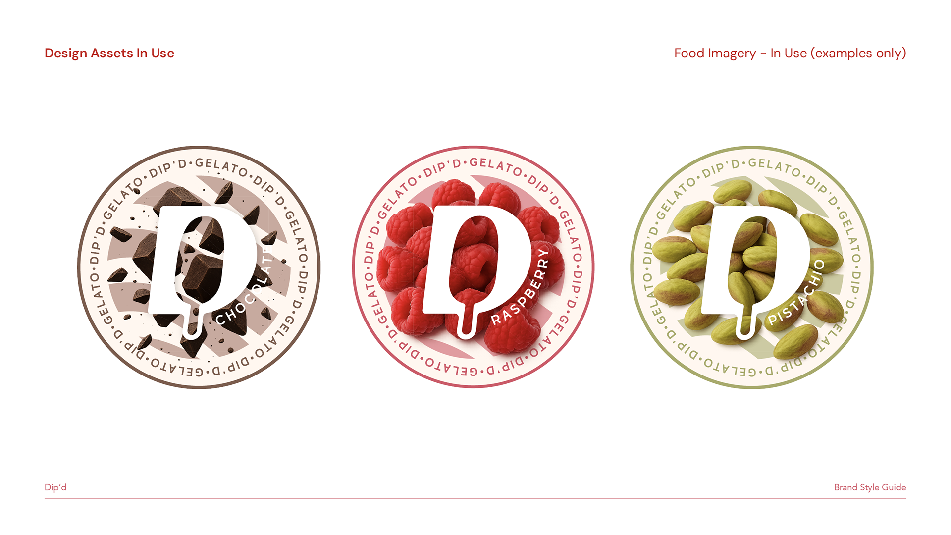
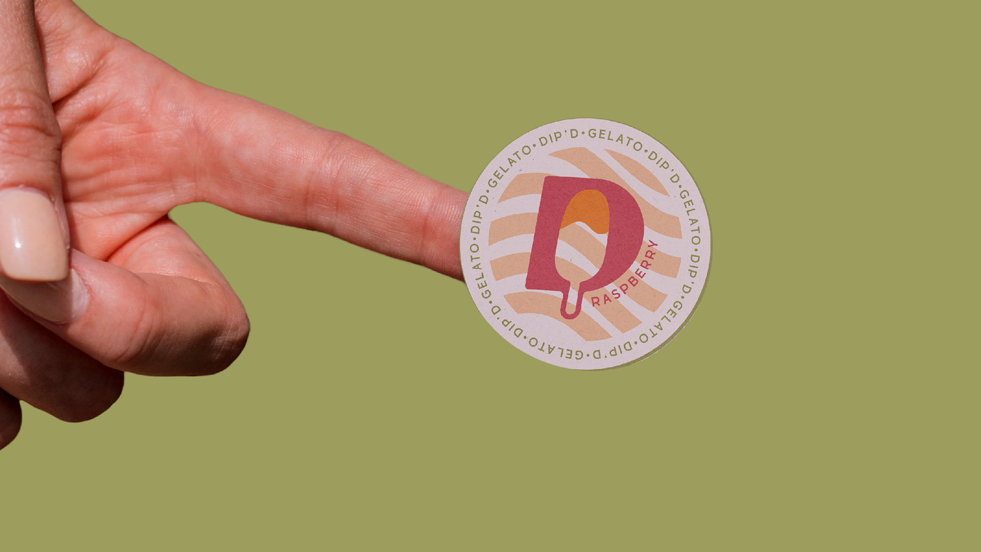
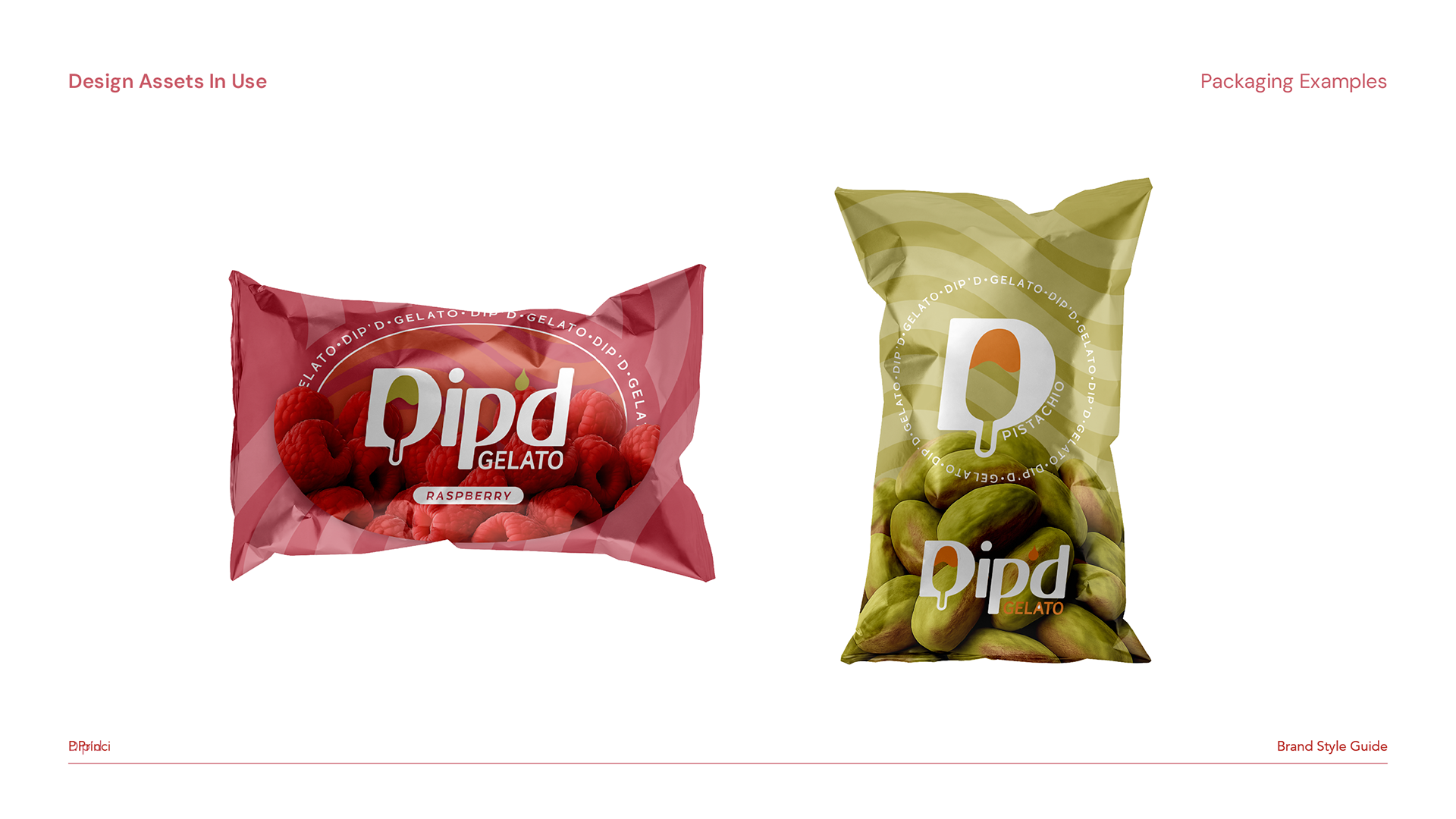
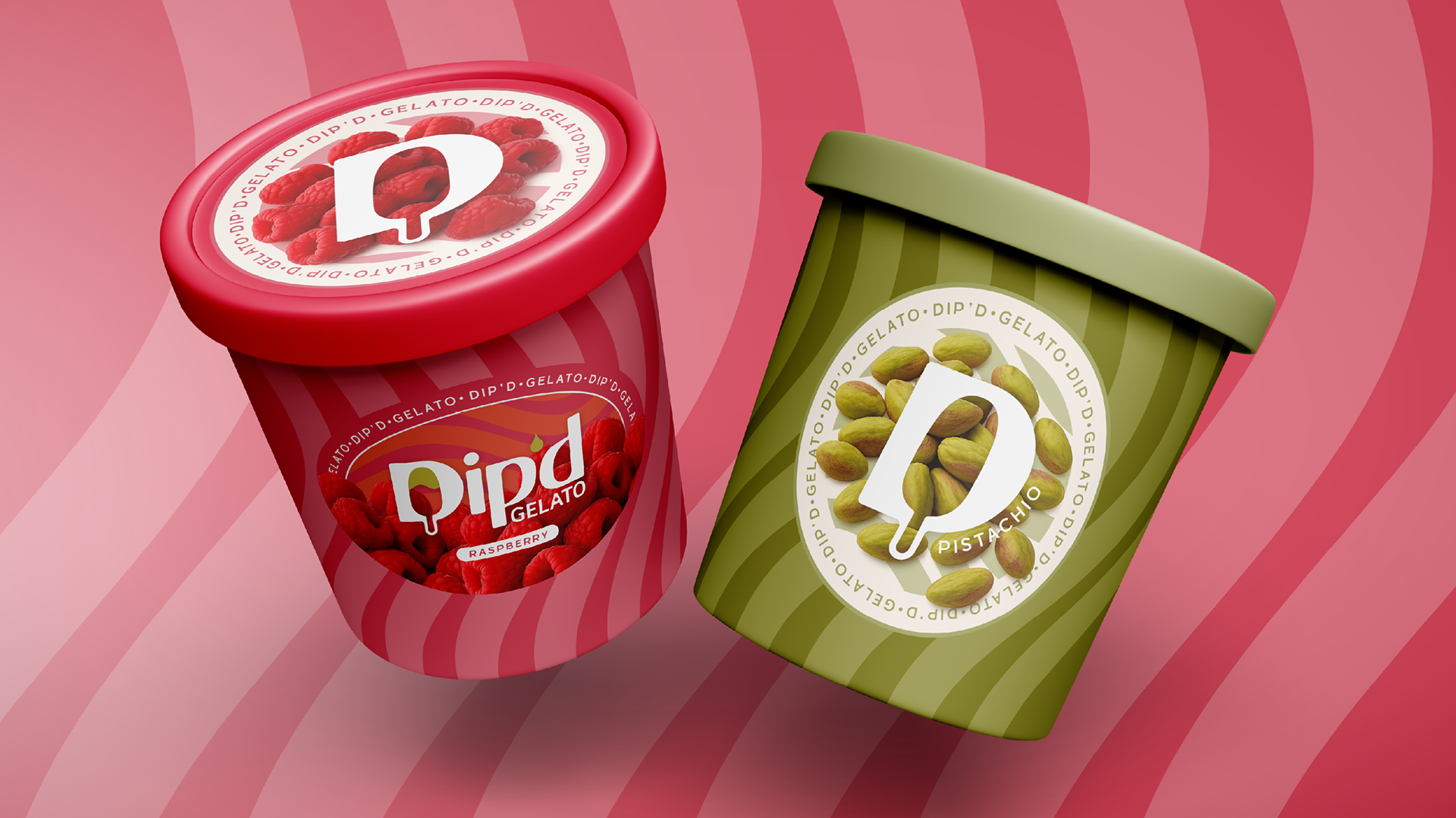

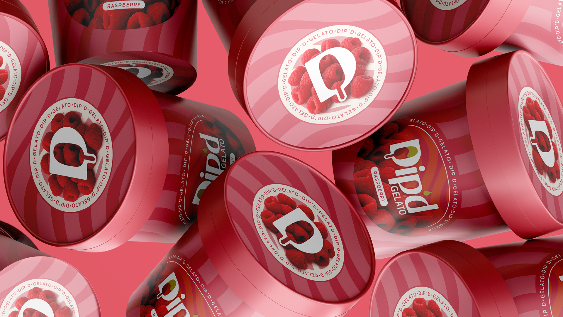

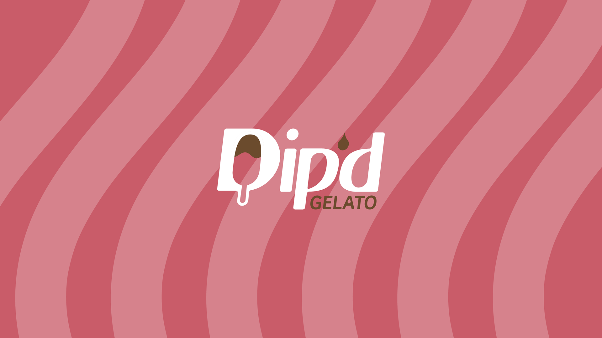
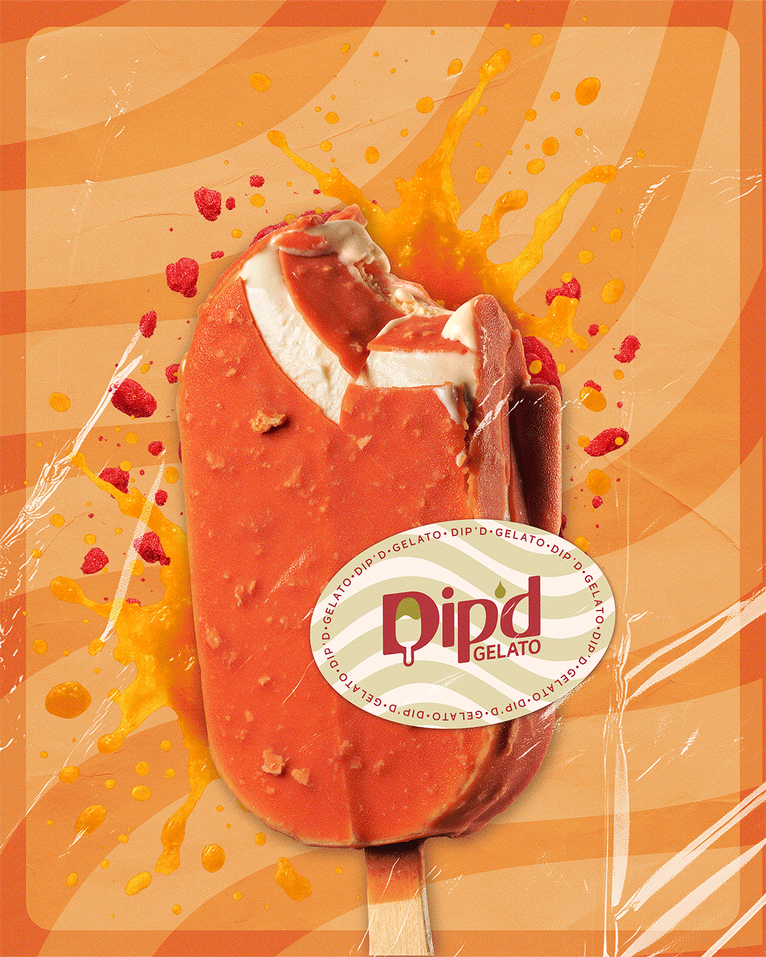
DIP’D Gelato was created as a bold yet playful brand that celebrates the craft of gelato through a refined, contemporary visual identity. As outlined in the Dip’d Brand Style Guide, the brand balances warmth and indulgence with clarity and consistency, using a flexible colour palette inspired by classic and flavour-driven ingredients such as chocolate, pistachio, raspberry and citrus tones.
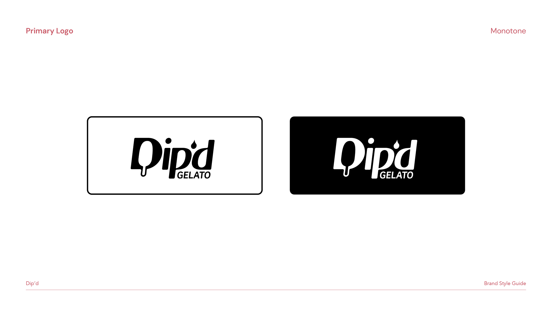
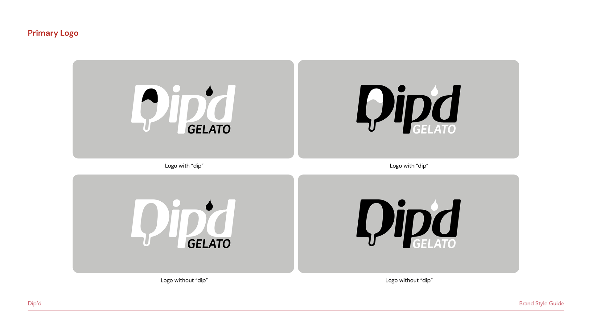
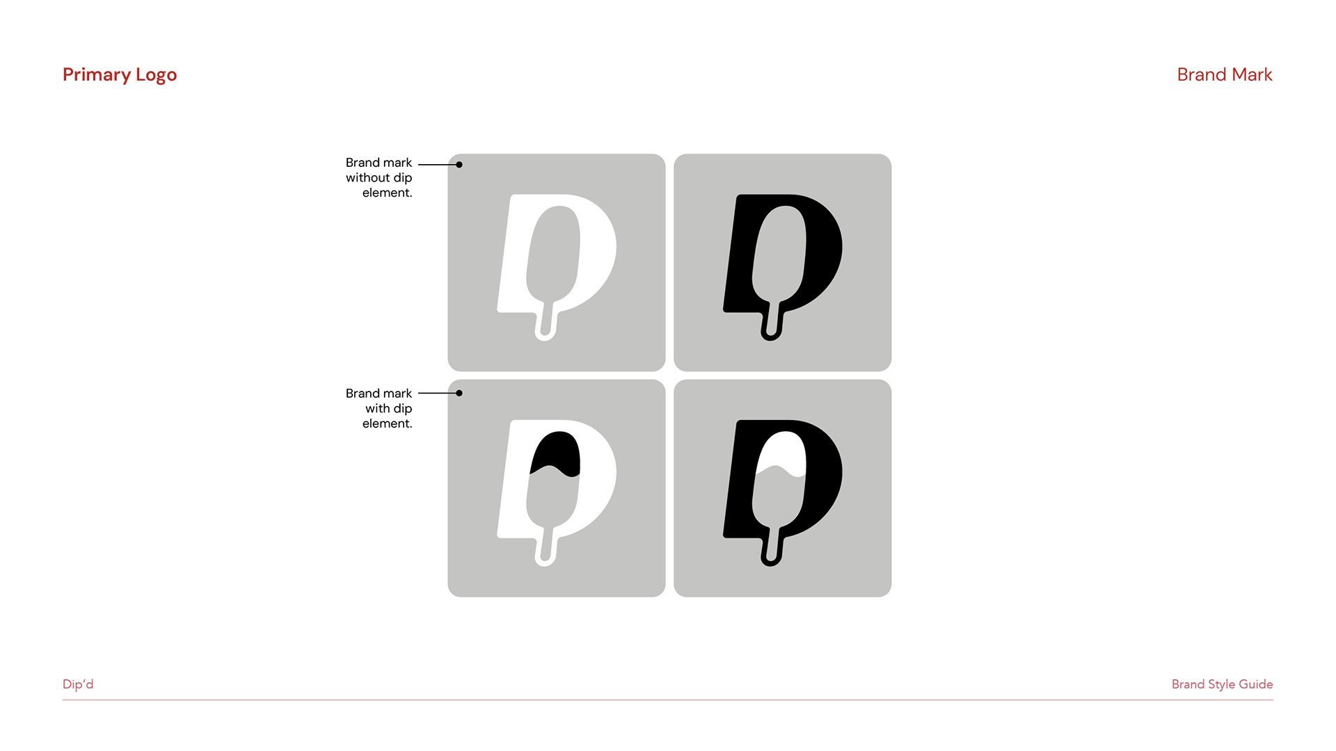
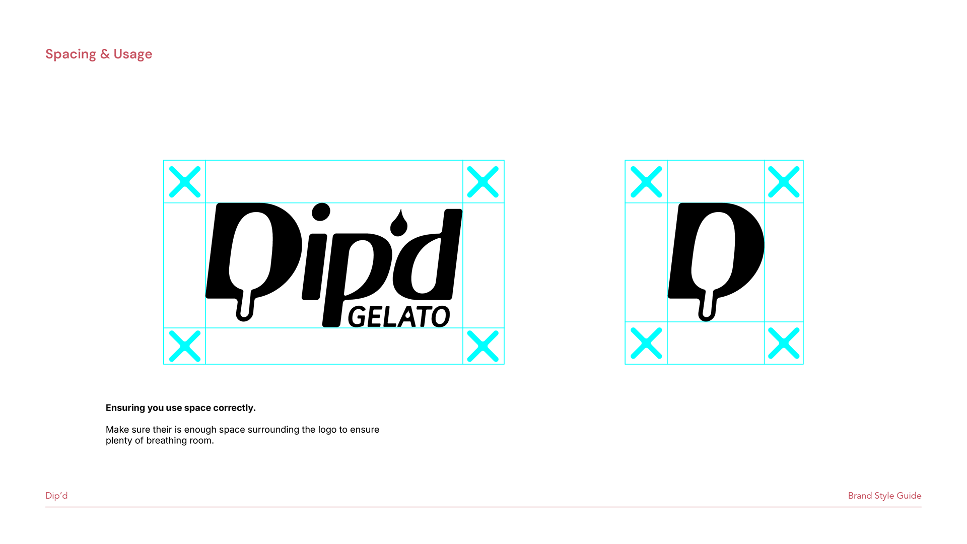
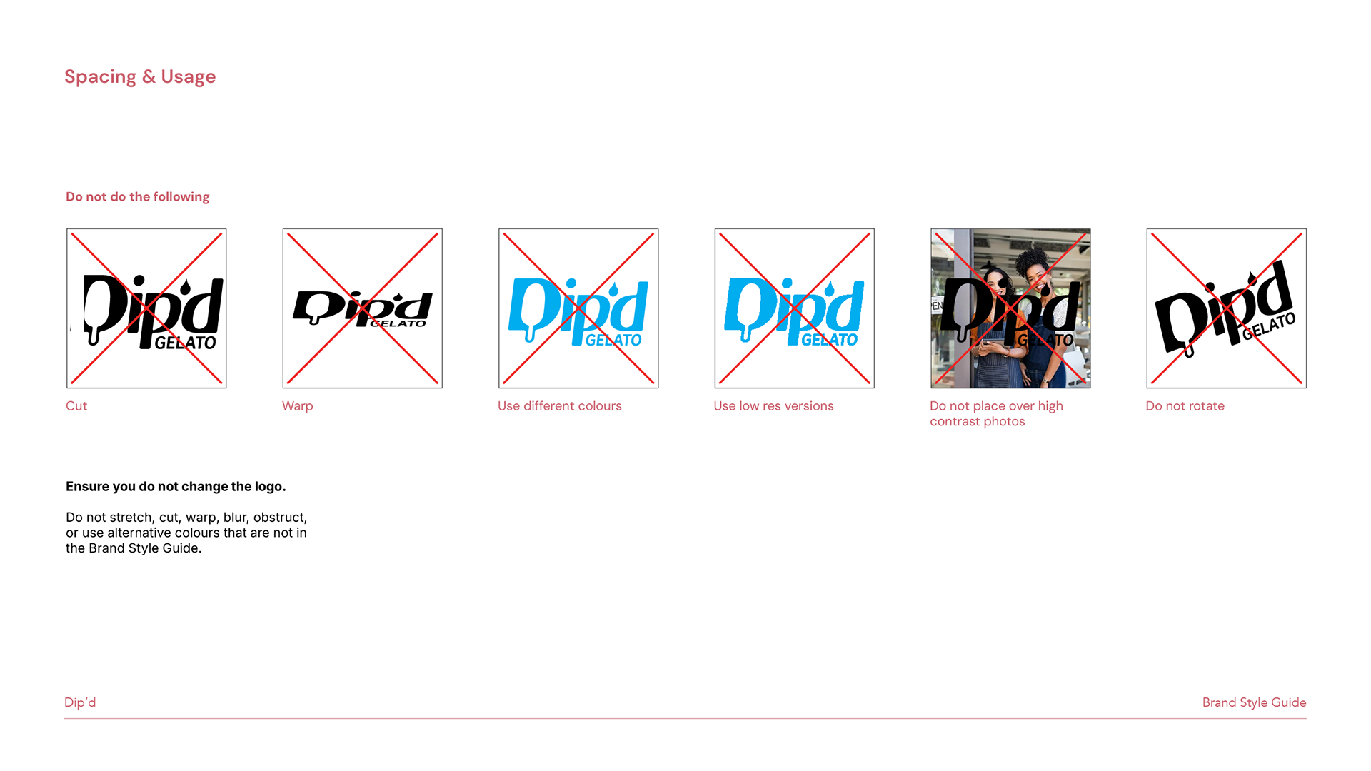
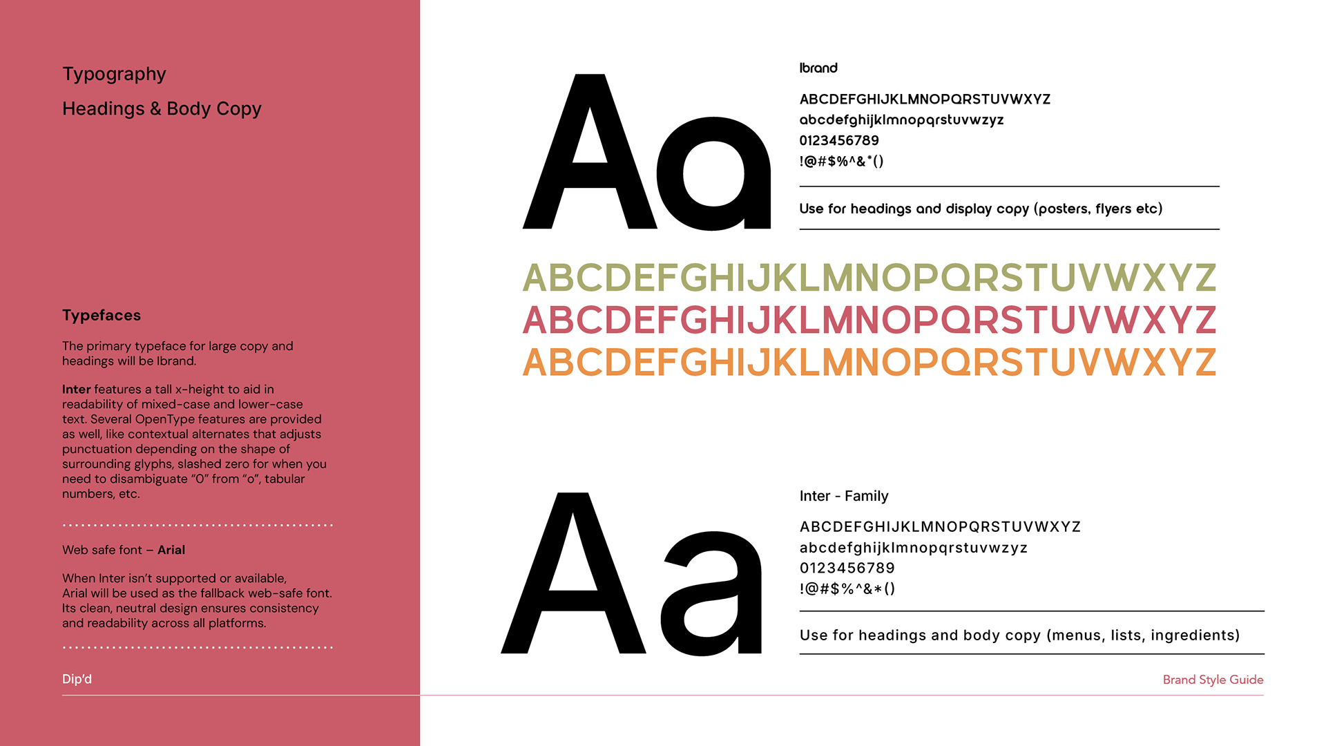
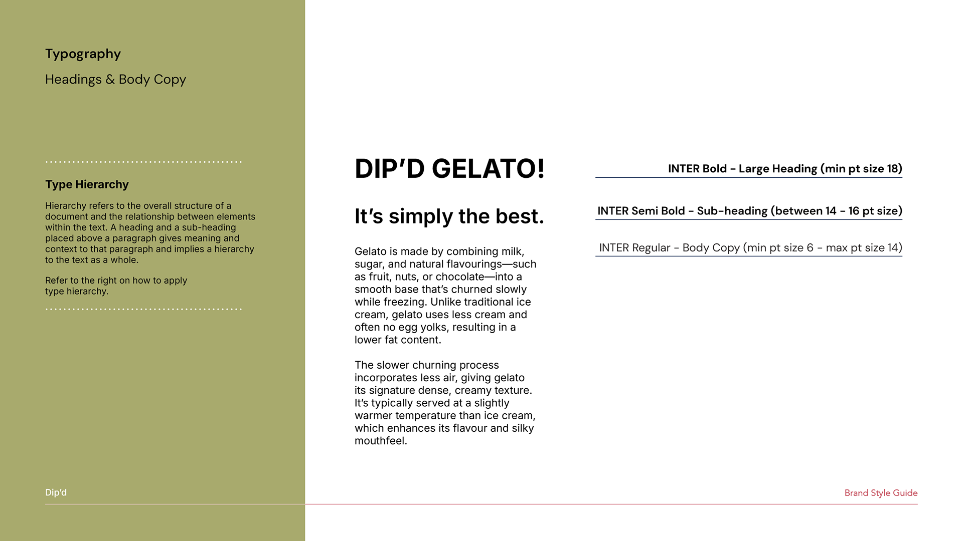
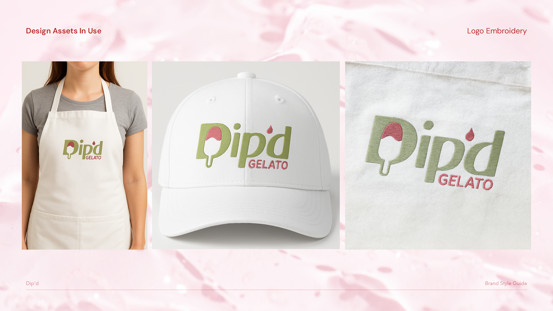
The logo system is designed to be versatile and recognisable across packaging, signage and digital platforms, with strict spacing and usage rules ensuring the brand always feels confident and premium. Typography plays a key role in expressing personality and readability, pairing expressive display type with the highly legible Inter family to support everything from bold headlines to detailed menu copy. Together, these elements form a cohesive style guide that allows DIP’D Gelato to feel vibrant, modern and artisanal, while remaining consistent across every touchpoint.
Created while working at Word Of Mouth Agency, Perth, WA.